2023-07-12-NAB이상탐지
시계열 데이터를 통한 이상 탐지 방식 (Numenta Anomaly)
데이터셋: Numenta Anomaly Benchmark (NAB) Kaggle
유용한 코드: Anomaly Detection - Streaming Data (Extended) Kaggle
프로젝트 소개
1일차에는 numpy와 pandas를 통해 데이터 처리 및 분류를 진행하며, 본 프로젝트에선 선형대수적 알고리즘을 통해 이상값을 탐지하고 matplotlib 를 통해 데이터를 시각화함과 동시에, numpy로 해석된 값이 이상 값인 경우 해당 이상값에 대한 콘솔 출력까지 요청하는 방향으로 진행하려 한다.
위 데이터 글을 통해 소개된 몇몇 알고리즘과 데이터에 대한 분석을 함과 동시에, 시각화만 하지 말고 데이터 처리에 대한 결과를 출력을 진행한다.
2일차에는 LSTM 알고리즘을 사용하여 모델을 작성하고 이를 시각화한 다음 결과를 낸다. 또한, 1일차에 진행한 알고리즘을 통한 결과와 비교하여 결론을 낸다.
1일차
데이터 탐색
import warnings
warnings.filterwarnings('ignore')

import pickle # dump variables
import numpy as np # linear algebra
import pandas as pd # data processing, CSV file I/O (e.g. pd.read_csv)
import datetime as dt # datetime lib

import seaborn as sns
import matplotlib.pyplot as plt
마크다운 코드에 효과주는 방법은 어디있나요
해당 프로젝트에선 라이브러리를 위와 같은 것들로 사용하여 데이터 정제와 출력을 진행한다.
또한, 몇몇 설정을 통해 그냥 csv를 출력하지 않고 조금 이쁘게 출력하도록 한다. matplot의 설정에 따라 그래프가 요동칠 수 있고, 아니면 불필요하게 너무 많은 정보를 제공할 수 있다.
아래는 링크의 프로젝트에서 사용한 라이브러리들의 기본 설정이다.
# Matplotlib styles and plot again.
plt.rcdefaults()

sns.set(rc={'figure.figsize': tuple(plt.rcParams['figure.figsize'])})
sns.set(style="whitegrid", font_scale=1.75)

# prettify plots
plt.rcParams['figure.figsize'] = [20.0, 5.0]
plt.rcParams['figure.dpi'] = 200
sns.set_palette(sns.color_palette("muted"))

%matplotlib inline

#
# Increase the quality and resolution of our charts so we can copy/paste or just
# directly save from here.
#
# See https://ipython.org/ipython-doc/3/api/generated/IPython.display.html
from IPython.display import set_matplotlib_formats
set_matplotlib_formats('retina', quality=100)

## You can also just do this in Colab/Jupyter, some "magic":
%config InlineBackend.figure_format='retina'
데이터 구조
프로젝트의 데이터셋은 대부분 csv 파일 형식으로 되어 있으며, pandas를 통해 csv 파일을 읽고 이를 numpy 라이브러리로 선형대수적(linear-algbrea) 방식으로 데이터를 계산하고 해석하는 절차를 통해 프로젝트에서 이상값을 탐지 - 후속 절차를 진행한다.
코랩이나 다른 클라우드 시스템의 경우 파일을 업로드하고 이를 압축 해제하는게 먼저인데 아래 간단한 코드를 사용하여 해제하고 작동할 수 있다.
## colab start the "/content" url to upload file (recommanded)
## 만약 jupyter 등의 다른 노트북을 쓴다면, 경로를 재주것 바꿔주자. 아래 소개할 코드들도 다 /content/NAB로 진행됨
import zipfile
with zipfile.ZipFile('/content/archive.zip', 'r') as zip_ref:
    zip_ref.extractall('/content/NAB')
## input data
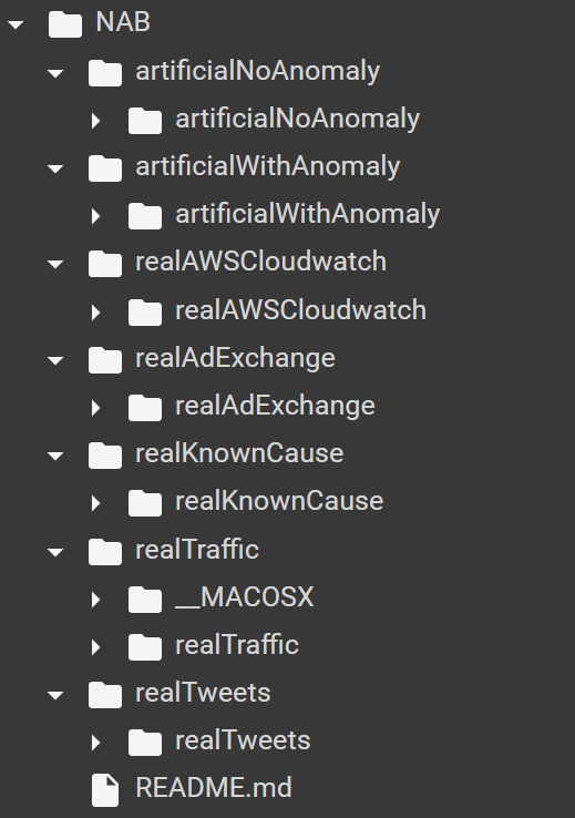
cpu = pd.read_csv('/content/NAB/realAWSCloudwatch/realAWSCloudwatch/ec2_cpu_utilization_53ea38.csv')
network = pd.read_csv('/content/NAB/realAWSCloudwatch/realAWSCloudwatch/ec2_network_in_5abac7.csv')
traffic = pd.read_csv('/content/NAB/realTraffic/realTraffic/TravelTime_387.csv')
## 각각 cpu, network, traffic 관련 데이터 원본
데이터 양이 많은 편 이므로, 이 중 몇개에 대해서만 관련 데이터를 넣고 이를 출력하도록 한다
## ploting data
cpu.plot()
network.plot()
traffic.plot()
데이터를 출력했을 때의 결과
cpu - network - traffic
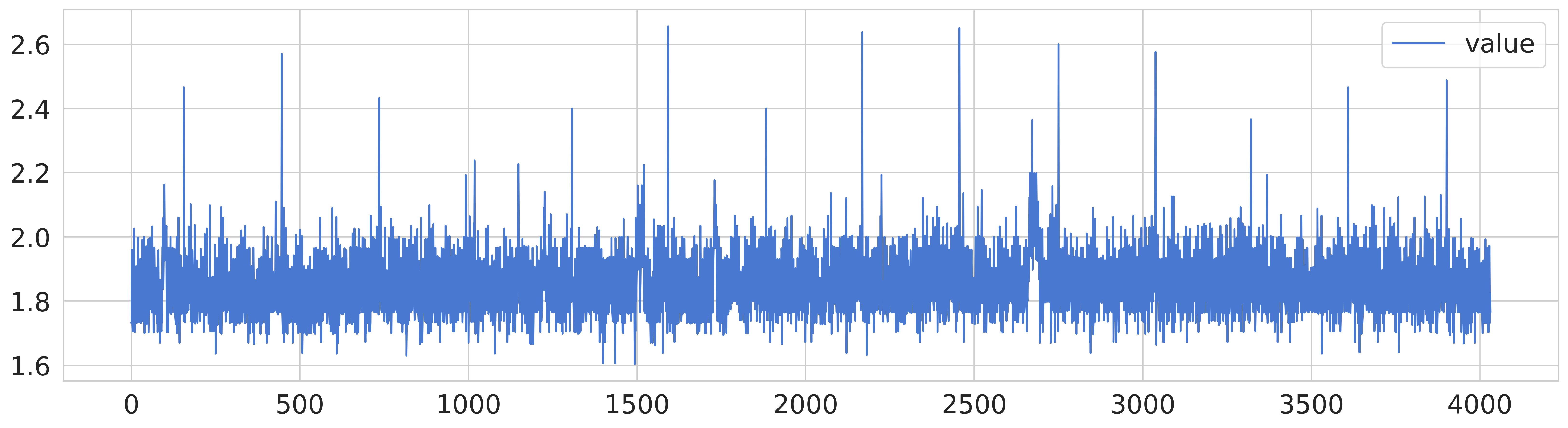
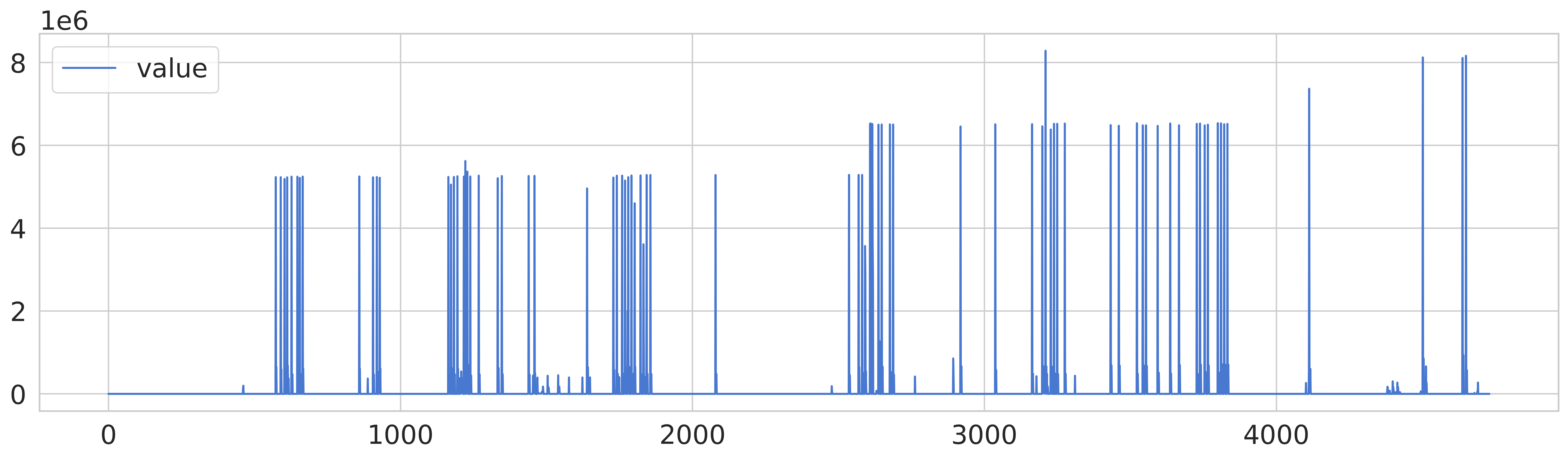
cpu 데이터의 경우, 다른 데이터에 비해 노이즈가 있는 편이고 네트워크 데이터는 특정 시점에서 급격한 상승이 발생하며, 교통 데이터는 일부 이상값이 존재하는 데이터 패턴을 확인할 수 있다.
교통 데이터의 경우 원본을 그래프로 출력하는 것 만으로도 이상 값이 눈에 보이는 편이나, 다른 두 데이터셋에 대해서는 이상값을 판단할려면 추가적인 정제 작업을 거쳐야 할 것이다.
데이터 분석 및 시각화
기본적인 알고리즘을 통한 시각화
해당 글에서 소개된 알고리즘 중 가장 먼저 위에 있다는 이유로 실행한 Streaming Moving Average 에 대해 실행해보고 시각화를 진행해본다.
시각화에 사용하는 메소드(? 파이썬을 자주 하지 않아 편의상 이것으로 부름)는 아래와 같은 메소드를 사용하는데, LSTM이 아니라 전부 Moving~~ 형태의 알고리즘에는 이 방법으로 시각화를 하였으니 참고해 주기 바란다.
def plot_anomalies(dfs, algorithm, parameters, title=False, dumping=False):
    '''Plot the Streaming Data (an Anomalies)'''
    n = len(dfs)
    lin, col = 1, 1
    for i in range(1, n+1):
        if lin * col < i:
            if lin == col: col += 1
            else: lin += 1
    # create a subplot
    model_name = algorithm.__name__
    fig, axes = plt.subplots(lin, col, squeeze=False, sharex=False, sharey=False, figsize=(col*20, lin*5))
    fig.suptitle(f'Anomaly Detection - {model_name} ({parameters})')
    xlin, xcol = 0, 0
    for i, df in enumerate(dfs):
        # get data
        get_timestamp = lambda x: dt.datetime.strptime(x,'%Y-%m-%d %H:%M:%S').timestamp()
        X = df.timestamp.apply(lambda x: int(get_timestamp(x)))
        Y = df.value
        # predict anomalies
        model = algorithm(**parameters)
        preds = [model.detect(i, v, dumping=True) for i, v in zip(X, Y)]
        pred, values, stds = tuple(zip(*preds))
        # plot the results
        af  = pd.DataFrame(data={'x':X, 'value':Y, 'pred':pred})
        af2 = pd.DataFrame(data={'x':X, 'value':values, 'pred':pred, 'std': stds})
        af2['ymin'] = af2['value'] - af2['std']
        af2['ymax'] = af2['value'] + af2['std']
        size = af.pred.astype(int) * 20
        sns.lineplot(ax=axes[xlin, xcol], data=af, x='x', y='value')
        sns.scatterplot(ax=axes[xlin, xcol], data=af, x='x', y='value', hue='pred', s=size)
        if dumping: axes[xlin, xcol].fill_between(af2.x, af2.value, af2.ymax, facecolor='green', alpha=0.2)
        if title: axes[xlin, xcol].set_title(f'{title[i]}')
        # update posix
        xlin += 1
        if xlin == lin: xlin,xcol = 0, xcol+1


    plt.tight_layout()
    plt.show()

    ## print anomally
   ## model.print();
- 일단 단순한 모델을 사용하여 시각화
thershold 가 1이냐 2냐에 따른 차이 비교를 진행하는데 아래의 코드를 사용하여 다음과 같은 plot 를 그리도록 하였다.
class StreamingMovingAverage:
    '''Moving Average algorithm'''
    # https://pandas.pydata.org/pandas-docs/stable/reference/api/pandas.Series.rolling.html

    def __init__(self, threshold=1.5) -> None:
        # Parameters
        self.max_deviation_from_expected = threshold
        self.min_nof_records_in_model = 3
        self.max_nof_records_in_model = 3 * self.min_nof_records_in_model
        self.anomally = {}


    def detect(self, timestamp: int, value: float, dumping: bool=False) -> bool:
        '''Detect if is a Anomaly'''
        ## plot_anomalies 클래스에 preds = [model.detect(i, v, dumping=True) for i, v in zip(X, Y)] 에서 작동하는 코드


        self._update_state(timestamp, value)
        expected_value = self._expected_value(timestamp)
        # is there enough data and is not NaN value

        response, curr_value, deviation = False, value, 0.0
        if self._enough_data() and not np.isnan(expected_value):
            # is the value out of the boundary? when it decrease
            curr_value = expected_value
            deviation = self._standard_deviation() * self.max_deviation_from_expected
            # when it is higher than expected
            if expected_value + deviation < value:
                response = True
                ## 임계값의 timestamp와 값을 출력하도록 설정하기 위해 저장
                self.anomally[timestamp] = {'timestamp': timestamp, 'value': value}


        # dumping or not
        if dumping: return (response, curr_value, deviation)
        else: return response

    def _update_state(self, timestamp: int, value: float) -> None:
        '''Update the model state'''
        # check if it is the first time the model is run or if there is a big interval between the timestamps
        if not hasattr(self, 'previous_timestamp'):
            self._init_state(timestamp)
        # update the model state
        self.previous_timestamp = timestamp
        self.data_streaming.append(value)
        # is there a lot of data? remove one record
        if len(self.data_streaming) > self.max_nof_records_in_model:
            self.data_streaming.pop(0)

    def _init_state(self, timestamp: int) -> None:
        '''Reset the parameters'''
        self.previous_timestamp = timestamp
        self.data_streaming = list()

    def _enough_data(self) -> bool:
        '''Check if there is enough data'''
        return len(self.data_streaming) >= self.min_nof_records_in_model

    def _expected_value(self, timestamp: int) -> float:
        '''Return the expected value'''
        data = self.data_streaming
        data = pd.Series(data=data, dtype=float)
        many = self.min_nof_records_in_model
        return data.rolling(many, min_periods=1).mean().iloc[-1]

    def _standard_deviation(self) -> float:
        '''Return the standard deviation'''
        data = self.data_streaming
        return np.std(data, axis=0)

    def get_state(self) -> dict:
        '''Get the state'''
        self_dict = {key: value for key, value in self.__dict__.items()}
        return pickle.dumps(self_dict, 4)

    def set_state(self, state) -> None:
        '''Set the state'''
        _self = self
        ad = pickle.loads(state)
        for key, value in ad.items():
            setattr(_self, key, value)


## pandas 를 이용해 이상 값 프린팅
    def print(self):
      anomally = self.anomally
      df = pd.DataFrame.from_dict(anomally, orient='index', columns=['timestamp', 'value'])
      df.index = df.index.map(lambda x: x // 1000)
      df.columns = ['timestamp','Value']
      print(df.to_string())
시각화에 따른 결과를 분석한 결과 해당 알고리즘에선 theresold, 임계값에 대한 부분이 이상값이냐 아니냐를 분석하는 데에 큰 영향을 미친다. 수학적 알고리즘 방식으로 분석된 데이터의 경우 timestamp 간의 비교를 통해 어떤 임계점이 있는 경우를 이상값으로 판단하는 경향이 있는 듯 하다.
- StreamingMovingMAD를 통해 시각화
해당 방법으로 시각화를 하는 알고리즘과 곧 후술할 LSTM 모델을 통한 시각화 이렇게 진행할 것이다. 이 모델 사용한 이유는, 평균분산을 바탕으로 한 특별한 요소가 있으면서 코드가 비교적 간결하여 LSTM 과의 비교가 용이할 것으로 예상되었기 때문이다.
def mean_abs_dev(data):
    deviance = sum(abs(data - data.mean()))
    return deviance / len(data)
class StreamingMovingMAD(StreamingMovingAverage):
    '''Moving Mean Absolute Deviation (M.A.D) - using M.A.D instead of Arithmetic Mean (or Average)'''

    def __init__(self, threshold=1.5) -> None:
        super().__init__()
        # Parameters
        self.max_deviation_from_expected = threshold

    def _enough_data(self) -> bool:
        '''Check if there is enough data'''
        return len(self.data_streaming) > 0

    def _standard_deviation(self) -> float:
        '''Return the standard deviation'''
        data = self.data_streaming
        data = pd.Series(data=data, dtype=float)
        variance = mean_abs_dev(data) - data
        return pow(sum(variance ** 2) / len(data), 1/2)

    def _expected_value(self, timestamp: int) -> float:
        '''Return the expected value'''
        data = self.data_streaming
        data = pd.Series(data=data, dtype=float)
        return mean_abs_dev(data)
algorithm = StreamingMovingMAD
parameters = {'threshold': 2.0}
title = ['CPU Utilization', 'Network Usage', 'Travel Time', 'Twitter Volume']
plot_anomalies([cpu, network, traffic, twitter], algorithm, parameters, title)

해당 데이터를 통해 확인할 수 있는 점은 MAD 방식으로 이상 탐지를 진행할 때에는 트위터 볼륨 값의 상당수가 이상 값으로 판정이 되며, 이를 보완할 방법이 여러 가지가 필요하게 된다. threshold를 줄여서 판단하거나, 아니면 트위터에 한해 다른 알고리즘을 사용하거나 할 필요가 있어 보인다.
이를 보완하기 위해 다른 통계적 알고리즘을 사용하는 대신, LSTM 방식을 통해 4개 항목을 테스트하고, 이를 비교하는 과정을 거치려 한다.
LSTM을 통한 데이터 분석 및 시각화
- LSTM은 무엇인가

이상한 필기가 같이 적혀있는데, 크게 신경 쓸 필요 없이 게이트 여러개로 기억을 유지하면서 일부는 유지하고, 새로운 데이터를 받아들여가면서 장기적인 시계열 데이터에 적합한 모델로 소개가 된 모델이다.이를 묘사한 논리 회로도가 위와 같다.
방구석 데이터사이언티스트는 이걸 뿌리부터 건들 필요 없이. model.add(LSTM(50, activation='relu', input_shape=(None, 1))) 이거 한줄만 쳐도 된다. 정확한 사용 방법은 텐서플로우 model api를 참고해가면서 활성함수나 노드개수 등등등을 지정하면서 조정을 할 필요가 있으나 이 프로젝트에선 제공되는 데이터가 크게 무겁지 않기 때문에 기본적인 부분만 조정하여 작성한다.
from sklearn.preprocessing import MinMaxScaler
from tensorflow.keras.models import Sequential
from tensorflow.keras.layers import LSTM, Dense

## 위에서 이미 import 한 패키지면 아래는 생략 가능
import pandas as pd
import numpy as np
import matplotlib.pyplot as plt

# Step 1: Load and preprocess data

data = pd.read_csv('/content/NAB/realAWSCloudwatch/realAWSCloudwatch/ec2_cpu_utilization_53ea38.csv')
data['timestamp'] = pd.to_datetime(data['timestamp'])
## timestamp 영역의 데이터는 String으로 읽었으므로, unix datetime으로 변환이 필요하다
data['timestamp'] = data['timestamp'].astype(np.int64)  # Convert to nanoseconds since the Unix epoch
values = data['value'].values.reshape(-1, 1)

# Normalize the 'timestamp' column
scaler = MinMaxScaler()
data['timestamp'] = scaler.fit_transform(data['timestamp'].values.reshape(-1, 1))
## datetime을 normalize 하여 위의 비 LSTM 모델과 유사한 그래프를 그릴 수 있도록 설정

# Step 2: Split data into training and test sets
train_size = int(len(values) * 0.8)
train_data, test_data = values[:train_size], values[train_size:]
train_timestamps, test_timestamps = data['timestamp'][:train_size], data['timestamp'][train_size:]
## 항상 train 과 test 데이터를 8:2로 나누는 것이 적절하다고 항상 이렇게 나눈다.

# Step 3: Build and train LSTM model
model = Sequential()
## 시퀸셜 모델 << cnn대비 rnn에 적합하도록 모델 설정
model.add(LSTM(50, activation='relu', input_shape=(None, 1)))
model.add(Dense(1))
model.compile(optimizer='adam', loss='mse')
model.fit(train_data, train_data, epochs=25, batch_size=128)

# Step 4: Perform anomaly detection
predicted_values = model.predict(test_data)
mse = np.mean(np.power(test_data - predicted_values, 2), axis=1)
threshold = np.percentile(mse, 75)  # Adjust the percentile threshold as needed
## 70~95 사이를 설정, 이 값이 곧 모델의 민감한 정도?를 판단할 수 있는 기준이 된다.
anomalies = np.where(mse > threshold)[0]


# Step 5: Create plot with marked anomalies
plt.plot(test_timestamps, test_data, label='Actual')
plt.scatter(np.take(test_timestamps, anomalies), np.take(test_data, anomalies), color='red', label='Anomaly')
plt.xlabel('Normalized Timestamp')
plt.ylabel('Value')
plt.legend()
plt.show()
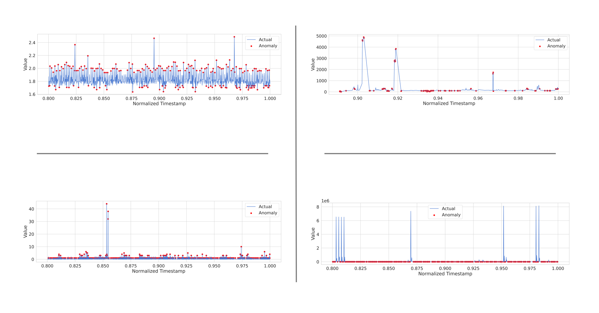
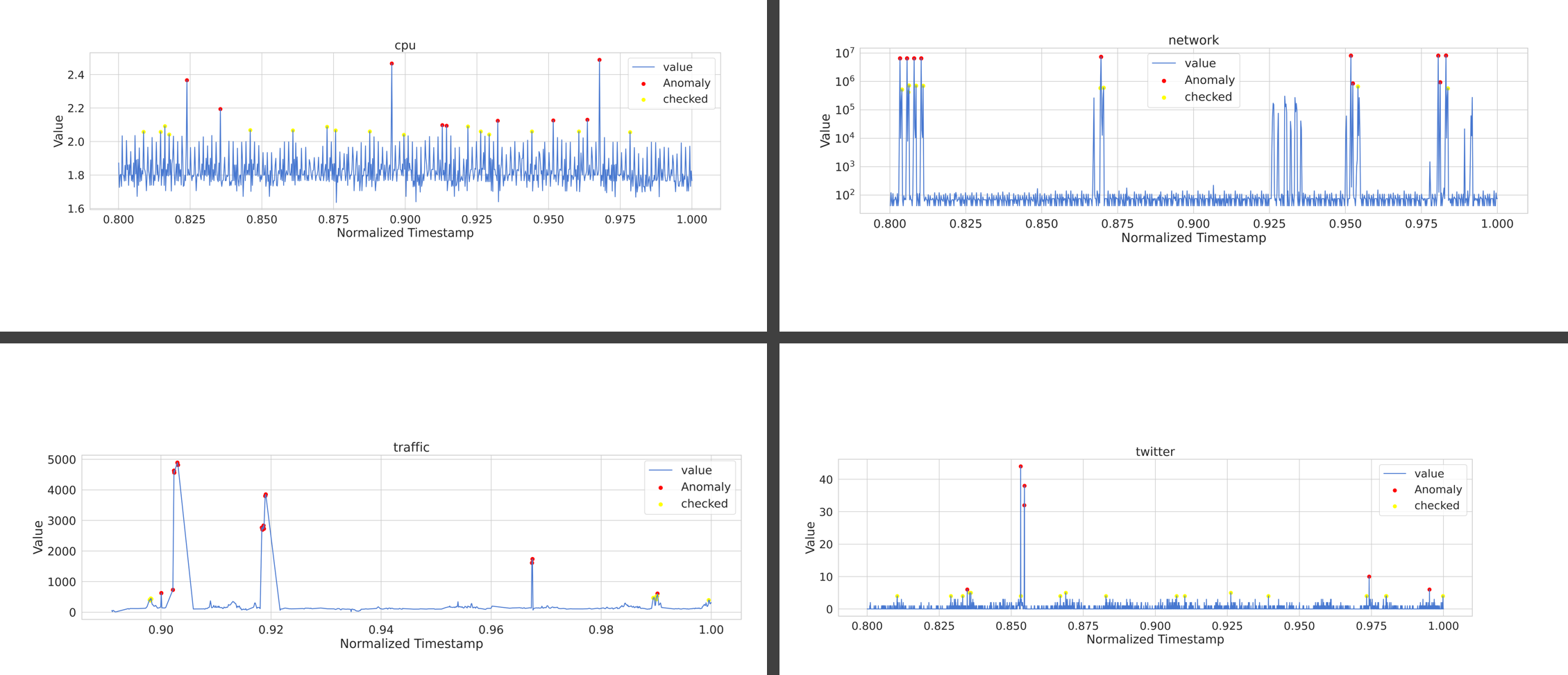
- ec2_cpu_utilization_53ea38 분석 결과
threshold를 75 정도로 설정했을 때의 이상 감임을 판단할 수 있는 마커의 분포 형태
이상 값을 분류할 때, cpu 사용량을 바탕으로 낸 결과는 조금 많이 threshold가 너무 낮은 탓인지 거의 대부분의 상황에 cpu 사용량의 증가가 전부 이상 값으로 판정되는 경향이 있다.
또한, 가장 큰 이상값 3군데 중 2군데는 꼭짓점이 아닌, 증가하고 감소하는 영역에서 이를 이상 값으로 판정했는데 다른 데이터세트도 동일하게 분석해야 결과가 나올 듯 하다.
- 4개 데이터를 동일하게 처리한 결과
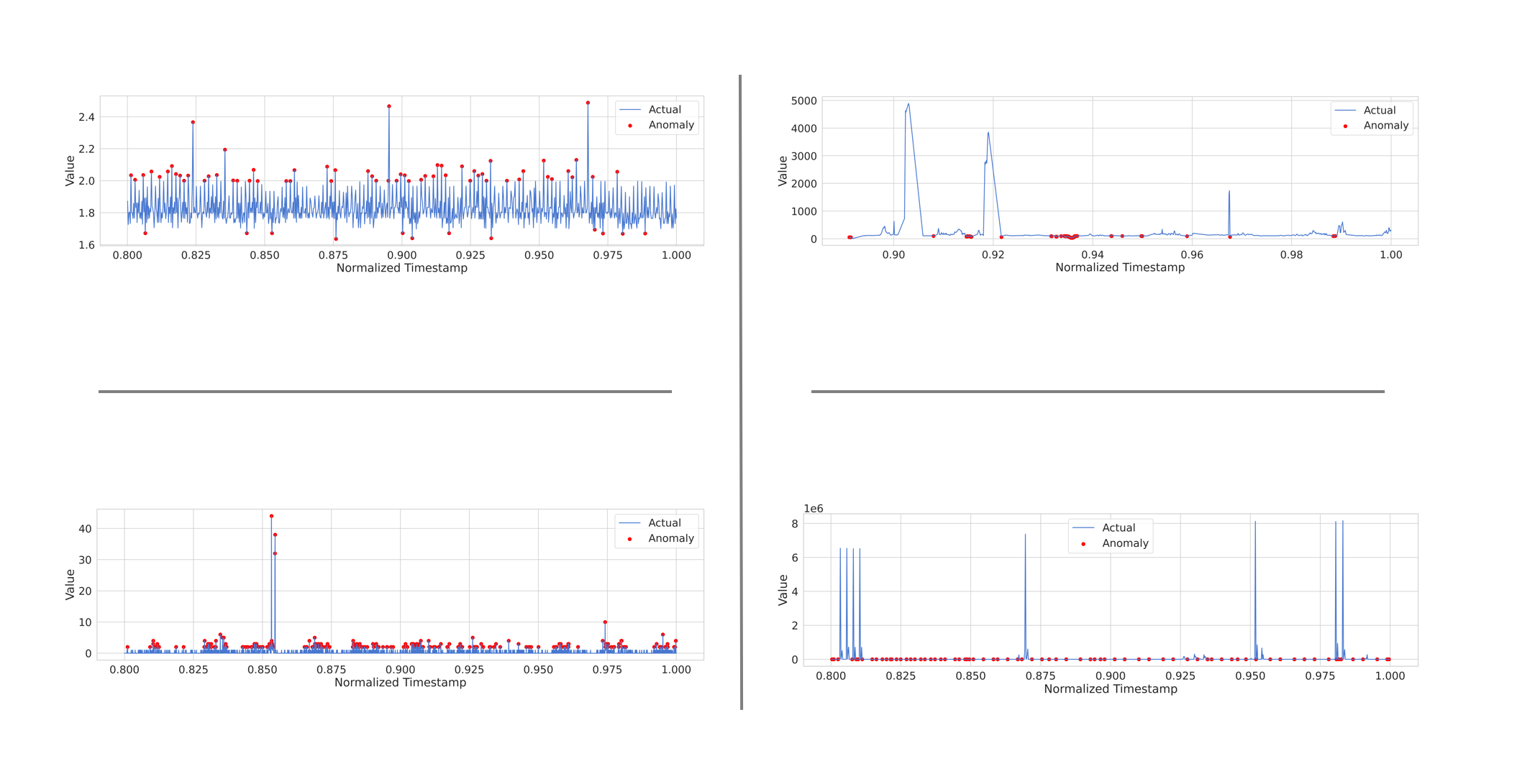
위: threshold 75
아래: threshold 90
| cpu | traffic |
| network |
순서로 배치됨
좀 더 확인해봐야 할 것 같지만, 비교적 cpu와 twitter의 경우 이상 값을 판단하고 이를 마커에 넣어두는게 좀 더 유의미한 반면에, traffic과 network에 대해서는 이상 값을 판단하지를 못하고 threshold를 조절하더라도 안되는 경우가 나온다. 최악은 network인데, 통신이 적은 걸 이상 값으로 판단하는 상태이다.
모델을 조정하여 해당 데이터가 좀 더 유용하도록 수정할 필요가 있으며, 내일 좀 더 조정한 다음에 유의미한 분석과 모델 구성을 진행해야 할 듯 하다. 또한, cpu 데이터의 경우 사용량이 낮은 건 중요하지 않은데 이를 이상 값으로 판단하는 상황인 만큼 이를 제어하는 것 역시 필요해 보인다.
사실 cpu는 사용량 애초에 낮은데 분석할 이유가 있나?
2일차
2일차에는 1일차 마지막에 있는 모델 상태를 좀 더 개선하는 방향으로 진행하는 것을 목표로 했으며, 그 중 가장 먼저 사용하는 방법은 relu? 활성 함수를 tanh 함수로 바꾸는 방법으로 진행하였다.
일단, 생각보다 결과가 잘 나온? 편이지만 한 개의 모델로 4가지 데이터를 사용하는건 썩 좋지 않았던 것 같다. 다만 이 방법으로도 유의미한 이상 탐지가 가능하여 특정 데이터는 이 모델로 이상 탐지를 진행하는 편이 좋은 것 같다.
import pandas as pd
import numpy as np
import tensorflow as tf
from sklearn.preprocessing import MinMaxScaler
from tensorflow.keras.models import Sequential
from tensorflow.keras.layers import LSTM, Dense
import matplotlib.pyplot as plt

## input data


def LSTM_TRY(data):
  # Step 1: Load and preprocess data
  data['timestamp'] = pd.to_datetime(data['timestamp'])
  data['timestamp'] = data['timestamp'].astype(np.int64)  # Convert to nanoseconds since the Unix epoch
  values = data['value'].values.reshape(-1, 1)

  # Normalize the 'timestamp' column
  scaler = MinMaxScaler()
  data['timestamp'] = scaler.fit_transform(data['timestamp'].values.reshape(-1, 1))

  # Step 2: Split data into training and test sets
  train_size = int(len(values) * 0.8)
  train_data, test_data = values[:train_size], values[train_size:]
  train_timestamps, test_timestamps = data['timestamp'][:train_size], data['timestamp'][train_size:]

  # Step 3: Build and train LSTM model
  model = Sequential()
  model.add(LSTM(50, activation='tanh', input_shape=(None, 1)))
  model.add(Dense(1))
  model.compile(optimizer='adam', loss='mse')
  model.fit(train_data, train_data, epochs=25, batch_size=128)

  # Step 4: Perform anomaly detection
  predicted_values = model.predict(test_data)
  mse = np.mean(np.power(test_data - predicted_values, 2), axis=1)
  threshold = np.percentile(mse, 90)  # Adjust the percentile threshold as needed
  anomalies = np.where(mse > threshold)[0]

  # Step 5: Create plot with marked anomalies
  plt.plot(test_timestamps, test_data, label='Actual')
  plt.scatter(np.take(test_timestamps, anomalies), np.take(test_data, anomalies), color='red', label='Anomaly')
  plt.xlabel('Normalized Timestamp')
  plt.ylabel('Value')
  plt.legend()
  plt.show()

cpu = pd.read_csv('/content/NAB/realAWSCloudwatch/realAWSCloudwatch/ec2_cpu_utilization_53ea38.csv')
network = pd.read_csv('/content/NAB/realAWSCloudwatch/realAWSCloudwatch/ec2_network_in_5abac7.csv')
traffic = pd.read_csv('/content/NAB/realTraffic/realTraffic/TravelTime_387.csv')
twitter = pd.read_csv('/content/NAB/realTweets/realTweets/Twitter_volume_CVS.csv')


LSTM_TRY(cpu)
LSTM_TRY(network)
LSTM_TRY(traffic)
LSTM_TRY(twitter)
사용한 코드
결과
| cpu | network |
| traffic |
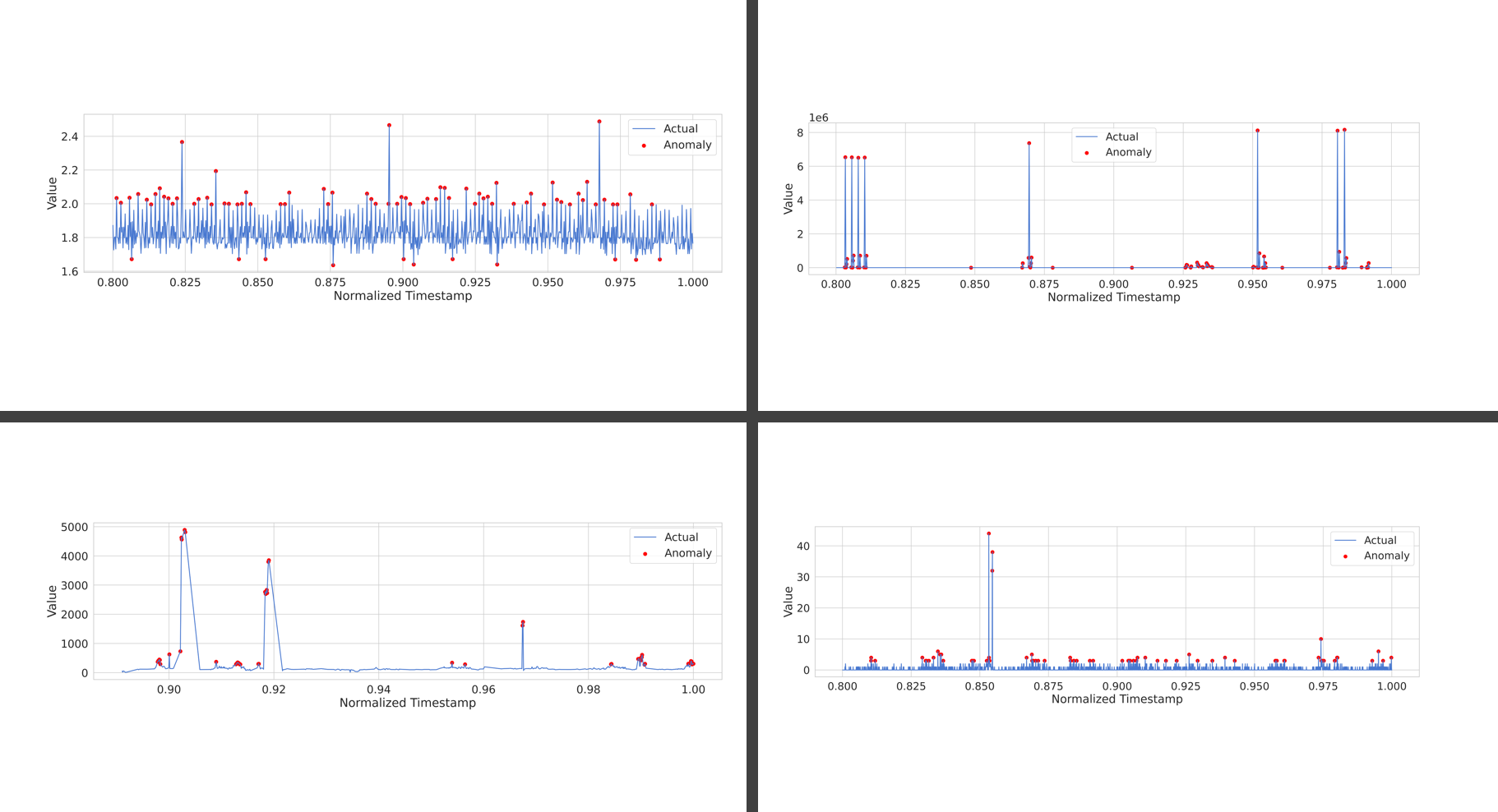
트위터에 한해선 생각보다 잘 나온 이상 탐지가 수행되었으며, traffic 에 대해서도 어제 보지 못했던 낮은 값에 점이 찍혀있는 모습 역시 꽤나 억제되었다. 이는 relu에 비해 tanh 가 같고 있는 특성으로 인해 발생한 특징인 것 같은데, 아래 글에 따르면 rnn 모델의 경우 적합한 활성 함수에 대해 tanh를 사용하는 것을 추천하는데, 이것이 어느 정도 유효한 듯 하다.
머신러닝 모델 활성화 함수(Activation function) 선택 방법 (tistory.com)
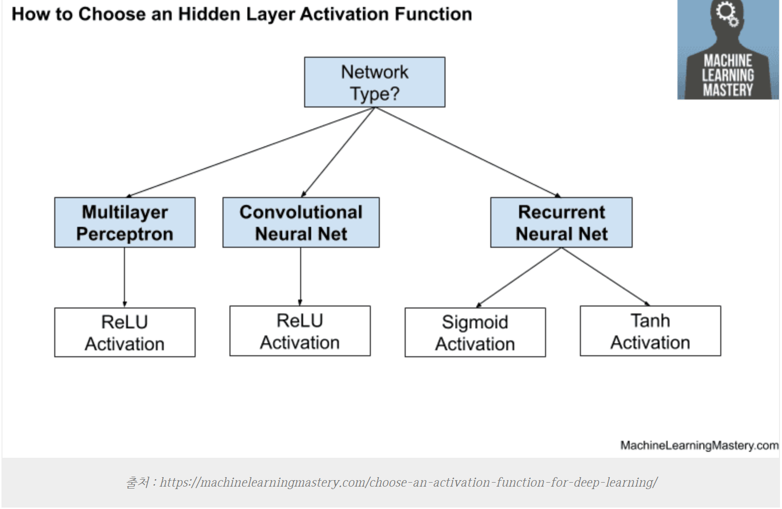
출처 : https://machinelearningmastery.com/choose-an-activation-function-for-deep-learning/
추가적으로 수행할 함수의 경우 다른 레이블을 붙여 anomaly의 전조 증상으로 취급하는 것이 좋을 것 같다는 생각과, 각 모델별로 좀 더 다른 형태의 모델로 변형하여 모델의 고도화를 진행하면 유용할 듯 하다.
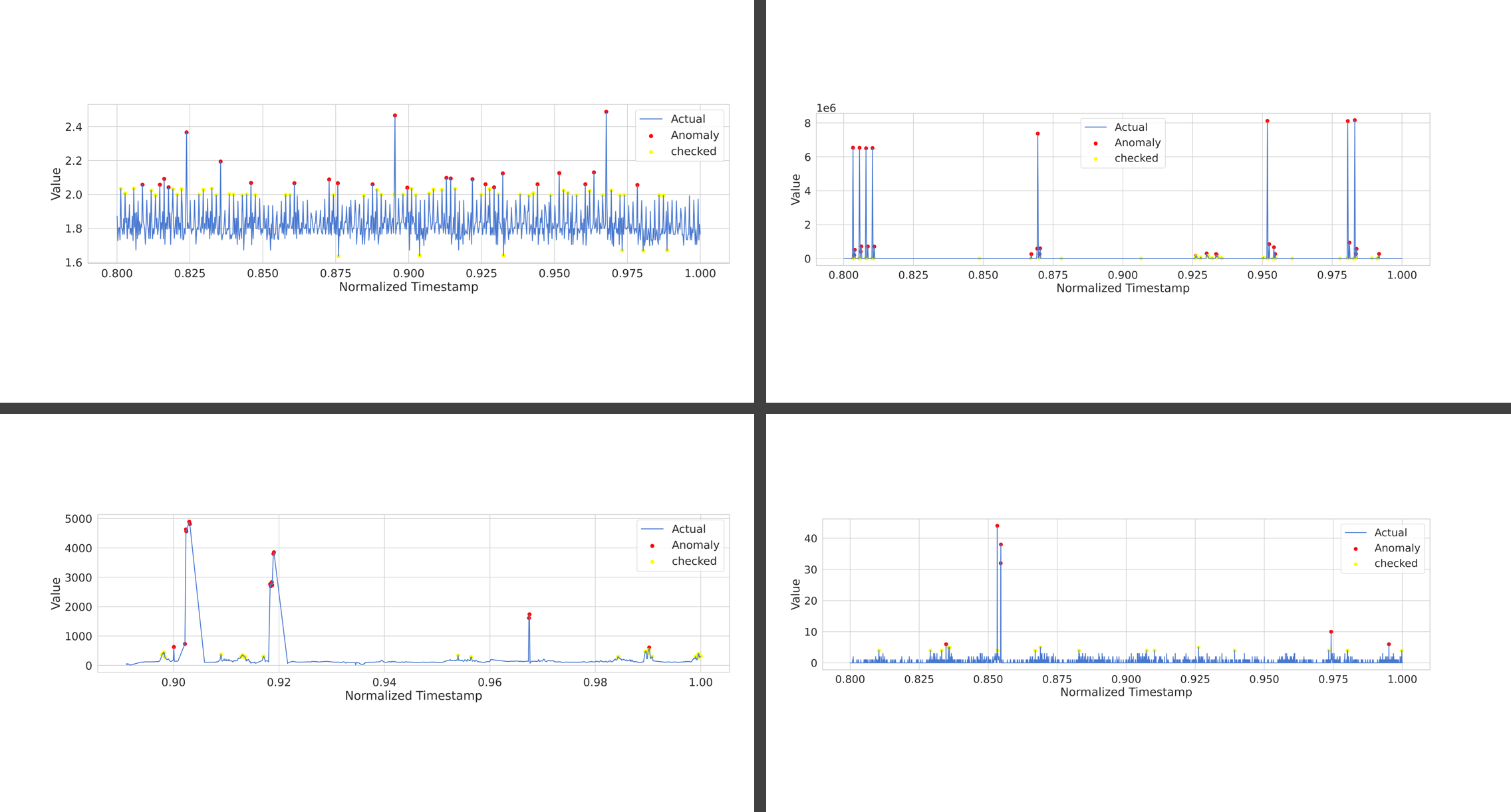
checked 라는 레이블을 붙여, 해당 값이 checked 인지 판단하도록 평가를 진행하고, 해당 평가를 통해 checked 상태와 anomaly 상태의 비교를 진행하고 각 데이터별로 threshold 를 나눠서 진행하는 것을 해보려 한다.
| cpu | network |
| traffic |
  # Step 3: Build and train LSTM model
  model = Sequential()
  model.add(LSTM(50, activation='tanh', input_shape=(None, 1)))
  model.add(Dense(1))
  model.compile(optimizer='adam', loss='mse')
  model.fit(train_data, train_data, epochs=25, batch_size=128)

  # Step 4: Perform anomaly detection
  predicted_values = model.predict(test_data)
  mse = np.mean(np.power(test_data - predicted_values, 2), axis=1)
  threshold1 = np.percentile(mse, 90)  # Adjust the percentile threshold as needed
  threshold2 = np.percentile(mse, 97)  # Adjust the percentile threshold as needed

  checked = np.where((threshold2 > mse) & (mse > threshold1))[0]
  anomalies = np.where(mse > threshold2)[0]

  # Step 5: Create plot with marked anomalies
  plt.plot(test_timestamps, test_data, label='value')
  plt.scatter(np.take(test_timestamps, anomalies), np.take(test_data, anomalies), color='red', label='Anomaly')
  plt.scatter(np.take(test_timestamps, checked), np.take(test_data, checked), color='yellow', label='checked')
  plt.xlabel('Normalized Timestamp')
  plt.ylabel('Value')
동일하게 tanh 활성함수를 사용하고 임계점을 둘로 나누어서 작업을 진행하였다. mse 기반의 threshold가 90 이상이면 checked, 97 이상이면 anomaly로 분류하여 시각화 하였고 그래도 여전히 한개의 모델을 사용했을 때의 불안정함으로 인해 최종적으로는 각 데이터별로 모델을 달리 하여 결과를 내는 것을 목표로 한다.
그리고, 라벨 안붙은것도 라벨 붙여서 그래프를 한번에 보기 편하게 설정해준다.
최종적으로 이상 탐지 결과가 위와 같이 지정되었는데, 진행한 작업은 다음과 같다.
- LSTM 모델을 사용하여 작업하고, cpu / network 에는 sigmoid 활성함수를 사용하였다. 그 이유는 sigmoid 의 활성함수를 사용하면 0 ~ 1 까지의 결과가 나오는데, 낮은 값은 이상 값이 아니므로 이 값을 어느정도 무시할 수 있다고 판단했기 때문이다.
- MSE의 수치를 상당히 좁게 설정했다. 낮은 값을 넣어봤자, 더 많은 이상과 체크 항목들이 생기는 만큼, 그냥 좁게 하는편이 이상 값을 추려내기 좀 더 유용할 것이라고 판단했다. 백신의 오진과 비슷한 개념으로. 안전 지향이 아닌 이상 일부만 추려내면 될 듯 하다.
- cpu 같은 경우 이상 값의 변동이 불규칙적인 만큼 사전 검사는 조금 어려운 측면이 있다. 점유율이 오르기 전 단계에 무슨 일이 생겼는지를 보는 것도 다른 데이터에 비해 큰 연관성이 적기도 하다.
- 네트워크 트래픽은 로그스케일 표기를 진행했는데, 기존 표기 방법으로는 트래픽의 양이 얼마나 차이나는지를 보기가 어려웠기 때문이다. 로그스케일로 표기한 결과, 왜 checked 항목들이 설정되었는지 시각적으로 쉽게 판단이 가능하게 되었다.
- 노란색 점은 하얀 화면에서 안보이는 것을 뒤늦게 깨닳았다.
이를 바탕으로 모델과 작동이 어느정도 일반화된 만큼, 코드 최적화를 진행하여 좀 더 짧고 중복없이 간결하게 처리되도록 변경한다.
코드 최적화
NOTEBOOK 파일 보기
이 과정을 진행한 노트북 파일은 아래 링크에서 확인해 볼 수 있다. (colab)
코드를 볼 때에는 노트북 파일이 훨씬 보기 좋으므로 참고
https://colab.research.google.com/drive/1AAprVJx3Z73lhPj2KxIy_Wn8nTjW2xAY?usp=sharing

notebook의 목차 기능을 이용하면, 영역별로 코드를 보기 좀 더 수월하다.
라이브러리 및 설정 정리
import warnings
warnings.filterwarnings('ignore')

## 기본 데이터 정리 라이브러리

import pickle # dump variables
import numpy as np # linear algebra
import pandas as pd # data processing, CSV file I/O (e.g. pd.read_csv)
import datetime as dt # datetime lib

import seaborn as sns
import matplotlib.pyplot as plt

## LSTM 모델을 사용하기 위한 텐서플로우 기반 라이브러리 추가

import tensorflow as tf
from sklearn.preprocessing import MinMaxScaler
from tensorflow.keras.models import Sequential
from tensorflow.keras.layers import LSTM, Dense
### 파일 입력 및 압축해제
import zipfile
with zipfile.ZipFile('/content/archive.zip', 'r') as zip_ref:
    zip_ref.extractall('/content/NAB')
matplotlib 스타일
# Matplotlib styles and plot again.
%matplotlib inline
plt.rcdefaults()

sns.set(rc={'figure.figsize': tuple(plt.rcParams['figure.figsize'])})
sns.set(style="whitegrid", font_scale=1.75)

# prettify plots
plt.rcParams['figure.figsize'] = [20.0, 5.0]
plt.rcParams['figure.dpi'] = 200
sns.set_palette(sns.color_palette("muted"))

#
# Increase the quality and resolution of our charts so we can copy/paste or just
# directly save from here.
#

## You can also just do this in Colab/Jupyter, some "magic":
%config InlineBackend.figure_format='retina'
# See https://ipython.org/ipython-doc/3/api/generated/IPython.display.html
from IPython.display import set_matplotlib_formats
set_matplotlib_formats('retina')
데이터 가공
데이터 입력 및 표시
## input data
## 구글 colab에 맞춰서 설정되어 있어요
cpu = pd.read_csv('/content/NAB/realAWSCloudwatch/realAWSCloudwatch/ec2_cpu_utilization_53ea38.csv')
network = pd.read_csv('/content/NAB/realAWSCloudwatch/realAWSCloudwatch/ec2_network_in_5abac7.csv')
traffic = pd.read_csv('/content/NAB/realTraffic/realTraffic/TravelTime_387.csv')
twitter = pd.read_csv('/content/NAB/realTweets/realTweets/Twitter_volume_CVS.csv')
## ploting data
cpu.plot()
network.plot()
traffic.plot()
twitter.plot()
## get the name of dataframe
def get_df_name(df):
    name =[x for x in globals() if globals()[x] is df][0]
    return name
데이터 전처리 부분
'''
String으로 처리되는 날짜 정보를 unix 날짜로 변환한다.
csv 파일의 타임스탬프를 float 형식으로 바꾸고
정규화하여 날짜 정보가 티가 나지 않게 설정한 다음
해당 데이터를 train과 test 8:2로 나눈다.
'''
def process_data(data):
  # Step 1: Load and preprocess data
  data['timestamp'] = pd.to_datetime(data['timestamp'])
  data['timestamp'] = data['timestamp'].astype(np.int64)  # Convert to nanoseconds since the Unix epoch
  values = data['value'].values.reshape(-1, 1)

  # Normalize the 'timestamp' column
  scaler = MinMaxScaler()
  data['timestamp'] = scaler.fit_transform(data['timestamp'].values.reshape(-1, 1))

  # Step 2: Split data into training and test sets
  train_size = int(len(values) * 0.8)
  train_data, test_data = values[:train_size], values[train_size:]
  train_timestamps, test_timestamps = data['timestamp'][:train_size], data['timestamp'][train_size:]
  return train_data, test_data, train_timestamps, test_timestamps
모델 설정 및 anomaly detection 기준 설정
'''
각 데이터별로 설정한 모델에 따라 수행하도록 함수를 정의하고 그에 맞춰 코드가 작동하도록 설정
'''
def model_cpu(train_data, test_data):
  # LSTM 노드128개 sigmoid 함수
  model = Sequential()
  model.add(LSTM(128, activation='sigmoid', input_shape=(None, 1)))
  model.add(Dense(1))
  model.compile(optimizer='adam', loss='mse')
  model.fit(train_data, train_data, epochs=25, batch_size=128)

  # Step 4: Perform anomaly detection
  predicted_values = model.predict(test_data)
  mse = np.mean(np.power(test_data - predicted_values, 2), axis=1)
  threshold1 = np.percentile(mse, 97)  # Adjust the percentile threshold as needed
  threshold2 = np.percentile(mse, 99)  # Adjust the percentile threshold as needed
  checked = np.where((threshold2 > mse) & (mse > threshold1))[0]
  anomalies = np.where(mse > threshold2)[0]
  return checked, anomalies


def model_network(train_data, test_data):
  # LSTM 노드256개 sigmoid 함수
  model = Sequential()
  model.add(LSTM(256, activation='sigmoid', input_shape=(None, 1)))
  model.add(Dense(1))
  model.compile(optimizer='adam', loss='mse')
  model.fit(train_data, train_data, epochs=25, batch_size=128)

  # Step 4: Perform anomaly detection
  predicted_values = model.predict(test_data)
  mse = np.mean(np.power(test_data - predicted_values, 2), axis=1)
  threshold1 = np.percentile(mse, 98)  # Adjust the percentile threshold as needed
  threshold2 = np.percentile(mse, 99)  # Adjust the percentile threshold as needed
  checked = np.where((threshold2 > mse) & (mse > threshold1))[0]
  anomalies = np.where(mse > threshold2)[0]
  return checked, anomalies

def model_traffic(train_data, test_data):
  # LSTM 노드 50개 tanh 함수
  model = Sequential()
  model.add(LSTM(50, activation='tanh', input_shape=(None, 1)))
  model.add(Dense(1))
  model.compile(optimizer='adam', loss='mse')
  model.fit(train_data, train_data, epochs=25, batch_size=128)

  # Step 4: Perform anomaly detection
  predicted_values = model.predict(test_data)
  mse = np.mean(np.power(test_data - predicted_values, 2), axis=1)
  threshold1 = np.percentile(mse, 95)  # Adjust the percentile threshold as needed
  threshold2 = np.percentile(mse, 97)  # Adjust the percentile threshold as needed
  checked = np.where((threshold2 > mse) & (mse > threshold1))[0]
  anomalies = np.where(mse > threshold2)[0]
  return checked, anomalies


def model_twitter(train_data, test_data):
  # LSTM 노드 256개 tanh 함수
  model = Sequential()
  model.add(LSTM(256, activation='tanh', input_shape=(None, 1)))
  model.add(Dense(1))
  model.compile(optimizer='adam', loss='mse')
  model.fit(train_data, train_data, epochs=25, batch_size=512)
  # Step 4: Perform anomaly detection
  predicted_values = model.predict(test_data)
  mse = np.mean(np.power(test_data - predicted_values, 2), axis=1)
  threshold1 = np.percentile(mse, 95)  # Adjust the percentile threshold as needed
  threshold2 = np.percentile(mse, 99.5)  # Adjust the percentile threshold as needed
  checked = np.where((threshold2 > mse) & (mse > threshold1))[0]
  anomalies = np.where(mse > threshold2)[0]
  return checked, anomalies
show plot
def plotting(test_timestamps,test_data, anomalies, checked, logscale, data_name):
  # Step 5: Create plot with marked anomalies
  plt.plot(test_timestamps, test_data, label='value')
  plt.scatter(np.take(test_timestamps, anomalies), np.take(test_data, anomalies), color='red', label='Anomaly')
  plt.scatter(np.take(test_timestamps, checked), np.take(test_data, checked), color='black', label='checked')
  plt.xlabel('Normalized Timestamp')
  plt.ylabel('Value')
  if(logscale==1):
    plt.yscale('log')

  plt.title(data_name)

  plt.legend()
  plt.show()
통합 함수
def test_model(data):
    # Step 1: Process the data
    train_data, test_data, train_timestamps, test_timestamps = process_data(data)

    ## logscale 은 기본적으로 0
    logscale = 0

    # Get the name of the dataframe
    data_name = get_df_name(data)

    print(data_name)

    # Switch case-like behavior based on the dataset name
    if data_name == 'cpu':
        checked, anomalies = model_cpu(train_data, test_data)
    elif data_name == 'network':
        checked, anomalies = model_network(train_data, test_data)
        logscale = 1
    elif data_name == 'traffic':
        checked, anomalies = model_traffic(train_data, test_data)
    elif data_name == 'twitter':
        checked, anomalies = model_twitter(train_data, test_data)
    else:
        print("Invalid dataset!")

    # Plotting the results
    plotting(test_timestamps, test_data, anomalies, checked, logscale, data_name)
test_model(cpu)      # Test the CPU dataset
test_model(network)  # Test the Network dataset
test_model(traffic)  # Test the Traffic dataset
test_model(twitter)  # Test the Twitter dataset
결론

수행 결과
데이터 자체의 특징만 보면, twitter와 traffic은 어느정도 연관이 있으며, traffic이 높으면 twitter에도 관련있는 유의미한 결과가 발생한다.
network 사용이 급증하면, 그 뒤에 CPU의 사용량이 증가하는 경향이 있다. 다만 항상 그렇지는 않다.
이상 값 탐지를 통해 LSTM 모델과 일반 알고리즘을 사용한 탐지는 몇 가지 차이가 난다.
- LSTM모델은 모델을 매번 작성할 때 마다 이상값의 판별이 달라진다. 비교적 일정하게 나오는 알고리즘 대신, model 기반의 이상값은 같은 파라미터를 사용하더라도 결과가 매 번 다르게 나온다.
- LSTM 모델이 좀 더 유연한 결과를 보장한다. LSTM모델을 사용하면 모델 활성함수나 노드 수, threshold 에 따른 설정에 따라 이상값을 판별하고 내보내는 결과가 좀 더 쉽게 제어 가능하고 해당 설정에 따른 결과물도 매번 다른 결과가 유연성으로 이어진다.
- 학습된 알고리즘은 블랙박스 영역이기 때문에, 모델의 구체적인 동작 방식에 대해 알 필요가 없다. 네트워크 내부의 동작 방식은 2 단계 모델이지만 모델 작성자가 해당 모델의 구체적인 활동 경로를 알 방법도 없고 필요도 없는 결과가 나온다.
- 네트워크에 대한 학습 시간이 존재한다. 시계열 텍스트 데이터를 바탕으로 한 이상값 탐지이기 때문에 비교적 적은 시간동안 학습이 가능했으나 만약 해당 데이터가 이미지나, 좀 더 복잡한 형태의 데이터라면 학습에 더 많은 시간이 소요됬을 것이다.
이상으로 NAB 를 통한 학습 결과에 대한 작성을 마친다.